
At Vivid Software Solutions, a San Diego website design company, we start the responsive web development process by crafting use cases the consumers intent and key conversion points on desktop tablet and handheld devices. We use web analytics, historical data and consumer research to support our approaches. We then start to define the information architecture, navigation and page structure, with low fidelity layouts or low flies. This is a fast way to create multiple options for designs and start to identify the challenges that we have to overcome. In this phase, we are also recognizing the paths that a consumer will take while navigating on desktop tablet and smartphone.
 Next, our user experience team establishes the layout grid structure and breakpoints. It is essential to keep a fluid layout rather than relying on three hard bricks because devices are rapidly changing size and aspect ratio as new devices are constantly entering the market. We always start by creating a base set of grid layouts, and standards for titles subtitles navigation for body fonts. This is very important because it helps us create consistency across layouts significantly reduces the code complexity and also has Organic SEO benefits by ensuring the page structure follows SEO best practices from the beginning. In addition, this will make future website maintenance much easier.
We use this guide to create interactivity in responsive wireframes giving an idea of how the site will feel and function on each device. Just taking your desktop content and shrinking it down to mobile is not the right approach. Smartphone users are often looking to make a transaction for the shortest amount of time tablet users often spend more time on site than even desktop users so tailoring your content approach per device is critical.
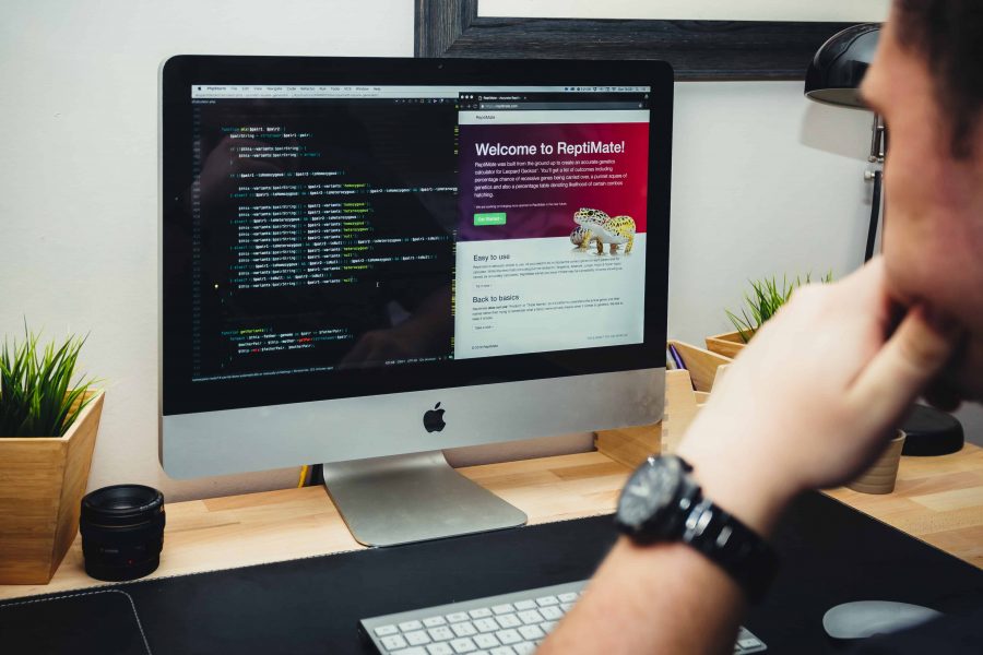
 After refinement of the user experiences our art directors apply the final design to the wireframes to bring the brand to life in its new digital format. Then our San Diego web design team builds all the interaction States. You must tailor those interactions per device. For example rollovers on a desktop must be converted to touch interactions clicking carousels should be swipe enabled on mobile. Before launch, we conduct QA testing on numerous devices. We don’t rely on automated testing software there is a physical aspect of navigating our mobile device because you are tapping touching and swiping.
It’s crucial that you physically test to see how everything feels and reacts on a mobile device and don’t be shy to go back and make changes to create a better experience for your customers. Post-launch is essential that you listen to your audience and adapt accordingly make sure that you have an in-depth analytics implementation and watch the user behavior on your website take suggestions to keep an open mind and listen to the analytics.
https://youtu.be/h3IdEqpjMvQ